Typography is one of the most powerful — and most overlooked — tools in a web designer's toolkit. When done well, it's invisible: readers simply absorb your content without friction. When done poorly, it creates fatigue, confusion, and distrust. This guide walks through the essential principles every designer and developer should know to craft typographic experiences that are both beautiful and functional.
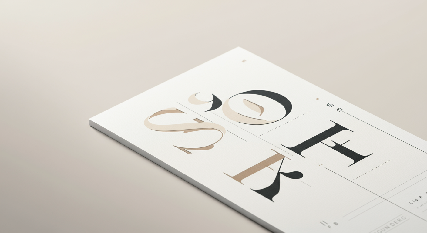
Choosing the Right Typeface
The typeface you choose sets the tone for your entire design. Before browsing font libraries, ask yourself: what personality should this text convey? A legal services firm and a children's toy brand have very different typographic needs. Broadly, typefaces fall into a few categories:
- Serif — Traditional, authoritative, and trustworthy. Great for editorial content, long-form reading, and brands that want to convey heritage (e.g., Georgia, Merriweather).
- Sans-serif — Clean, modern, and highly legible on screens. The go-to choice for UI text, dashboards, and tech products (e.g., Inter, Roboto, Helvetica).
- Monospace — Fixed-width characters ideal for code snippets, terminals, and technical documentation (e.g., Fira Code, JetBrains Mono).
- Display / Decorative — Expressive and attention-grabbing. Best reserved for headlines and hero sections, never for body copy.
Limit yourself to typefaces with a broad weight range (at least Regular, Medium, Bold, and ideally an Italic variant). This gives you flexibility without needing to introduce additional font families.
Font Pairing Principles
Pairing fonts is part science, part intuition. The goal is to create visual contrast and hierarchy while maintaining harmony. A few reliable strategies:
Serif + Sans-serif
This is the classic pairing. Use a serif for headings to add character and a sans-serif for body text to maximise screen legibility — or vice versa. The contrast between the two styles creates natural hierarchy without feeling chaotic.
Same Superfamily
Many type foundries release superfamilies that include both serif and sans-serif variants designed to work together (e.g., Source Serif + Source Sans, IBM Plex Serif + IBM Plex Sans). This is a foolproof approach — the fonts are designed to coexist.
Contrast in Weight, Not Just Style
If you prefer a single-family design, use dramatic weight contrast to establish hierarchy — a Light 300 body paired with a Black 900 heading creates a striking, cohesive look. Avoid pairing weights that are too similar (e.g., Regular 400 with Medium 500), as the difference is too subtle to read as intentional.
As a rule of thumb: use no more than two typefaces on a single page. Three is occasionally justified; four or more is almost always a mistake.
Line Height and Spacing
Whitespace is not wasted space — it is an active design element. Proper spacing dramatically improves readability and reduces cognitive load.
Line Height (Leading)
For body text, a line height of 1.5× to 1.75× the font size is the sweet spot for most typefaces. Headings, which are larger and read in shorter bursts, can use tighter leading — typically 1.1× to 1.3×. Avoid the browser default of 1.2 for body copy; it makes paragraphs feel cramped and difficult to track.
Letter Spacing (Tracking)
Body text rarely needs manual letter-spacing adjustments — the typeface designer has already optimised it. However, uppercase labels, small caps, and short UI strings often benefit from a small positive tracking value (0.05em to 0.1em) to improve legibility. Never apply tight negative tracking to body text.
Paragraph Spacing
Use margin-bottom on paragraphs rather than double line breaks. A spacing of 1em to 1.5em between paragraphs creates clear visual separation without breaking the reading flow. Consistent vertical rhythm — where spacing follows a base unit (e.g., 8px or 4px grid) — makes layouts feel polished and intentional.
Readability on Screens
Screen reading is fundamentally different from print reading. Pixels, backlighting, and variable viewing distances all affect how type is perceived. Here are the key considerations:
- Font size: Set body text at a minimum of 16px (1rem). Many modern designs use 18px–20px for long-form content. Anything smaller forces readers to strain, especially on mobile.
- Line length (measure): Aim for 60–80 characters per line (roughly 45–75 words). Lines that are too long cause the eye to lose its place; lines that are too short create a choppy, disjointed reading experience.
- Contrast: Ensure a minimum contrast ratio of 4.5:1 between text and background (WCAG AA standard). Pure black on white (#000 on #fff) can feel harsh — a dark grey like #1a1a1a on white is often more comfortable.
- Responsive scaling: Use relative units (rem, em, clamp()) rather than fixed pixel values. CSS clamp() is particularly powerful for fluid typography that scales smoothly between breakpoints.
- Dark mode: In dark mode, reduce font weight slightly (e.g., from 400 to 300) and avoid pure white text. Off-white (#e8e8e8 or similar) reduces halation and eye strain on OLED screens.
Web-Safe Fonts vs. Custom Fonts
The choice between system fonts and custom web fonts involves a trade-off between design control and performance.
Web-Safe & System Fonts
System font stacks (e.g., -apple-system, BlinkMacSystemFont, 'Segoe UI', Roboto) load instantly because they are already on the user's device. They render crisply at the OS level and require zero network requests. For performance-critical applications or content-heavy platforms, system fonts are an excellent choice. The trade-off is limited typographic personality — your site will look similar to the operating system's native UI.
Custom Web Fonts
Custom fonts give you full typographic control and brand differentiation. When using them, follow these performance best practices:
- Use modern formats: Serve fonts in WOFF2 format, which offers the best compression. Only fall back to WOFF for legacy browser support.
- Subset your fonts: If your content is in English, you don't need the full Unicode character set. Tools like Glyphhanger or Google Fonts' text= parameter can dramatically reduce file size.
- Preload critical fonts: Use <link rel="preload"> for your primary font files to eliminate render-blocking delays.
- Use font-display: swap: This ensures text remains visible during font loading, preventing invisible text (FOIT) and improving perceived performance.
- Self-host when possible: Self-hosting fonts eliminates third-party DNS lookups and gives you full control over caching headers, often resulting in faster load times than Google Fonts CDN.
Common Typography Mistakes to Avoid
Even experienced designers fall into these traps. Being aware of them is the first step to avoiding them.
- Using too many fonts. More than two typefaces on a page creates visual noise and undermines hierarchy. Stick to a deliberate, minimal palette.
- Ignoring font loading performance. Loading 8 font weights across 3 families can add hundreds of kilobytes to your page. Audit your font usage and load only what you need.
- Justified text on the web. Without proper hyphenation support, CSS text-align: justify creates uneven word spacing ("rivers" of whitespace) that severely harms readability. Use left-aligned text for body copy.
- All-caps body text. Uppercase text is significantly harder to read in long passages because it removes the distinctive ascenders and descenders that help readers recognise word shapes.
- Skipping a typographic scale. Arbitrary font sizes (13px, 17px, 22px, 31px) create visual inconsistency. Use a modular scale (e.g., Major Third: 1.25 ratio) to generate a harmonious set of sizes.
- Neglecting accessibility. Typography choices directly affect users with dyslexia, low vision, or cognitive differences. Test with real users and tools like axe or Lighthouse, and always meet WCAG contrast requirements.
Putting It All Together
Great web typography is not about using the most beautiful or trendy fonts — it is about making deliberate, informed decisions that serve your content and your audience. Start with a clear typographic hierarchy, choose typefaces that match your brand's voice, optimise for performance, and always test on real devices at real sizes.
Typography is a craft that rewards attention. The more intentional you are about every spacing decision, every weight choice, and every line length, the more your readers will trust and enjoy your content — even if they never consciously notice why.